A practical system for poster headlines, subheads, badges, CTAs, layout zones, and channel ratios—built for launch, promo, and paid social.
Great product posters fail more often on hierarchy than on “pretty backgrounds.” Shoppers decide in a second whether the product is clear, the offer is understandable, and the CTA is obvious. This guide focuses on copy blocks and layout zones you can reuse across launch, sale, and social ad posters.
The jobs a campaign poster must do
- Identify the product faster than the competitor next to it.
- State one primary message (launch, discount, benefit, seasonal).
- Point to an action (shop, learn more, limited drop).
- Survive the channel (ratio, mobile size, ad crop).
If a poster tries to say four offers at once, it usually says none.
Headlines, subheads, badges, and CTAs
| Block | Job | Practical length |
|---|---|---|
| Headline | Primary hook | About 2–6 words when possible |
| Subheadline | Support benefit or context | One short line |
| Badge | Offer / new / limited | Very short token |
| CTA | Next action | 2–4 words |
Write for the smallest placement first. If the badge dies on a phone grid, rewrite the badge—not the whole brand story.
Layout zones that keep the product readable
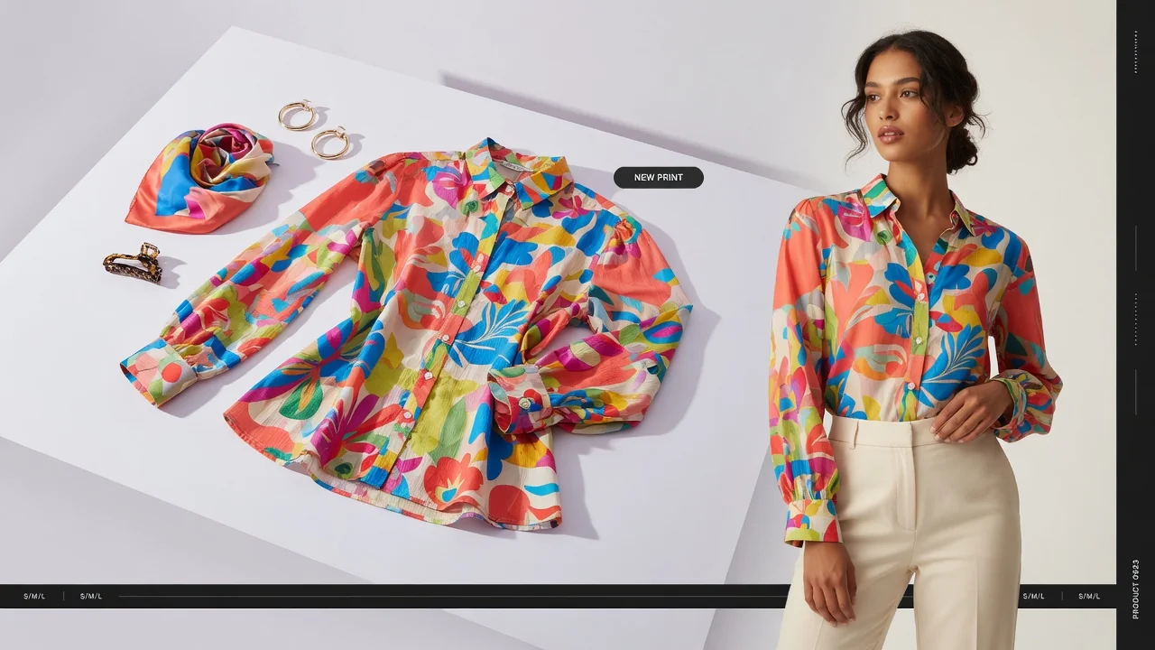
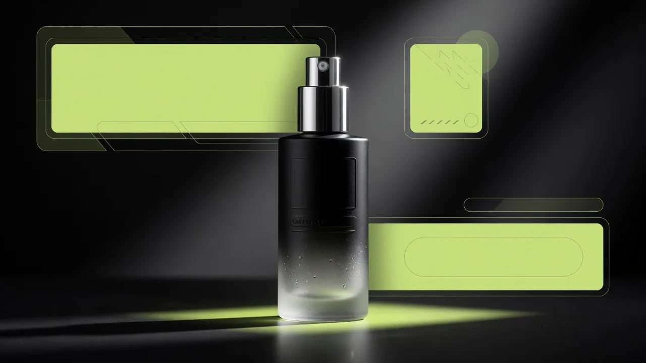
- Product zone: largest trusted area; avoid covering labels with stickers.
- Message zone: high contrast text area that does not fight packaging type.
- Badge zone: corner or edge; never on the product’s key face unless intentional.
- CTA zone: bottom or clear button-like region for ads.
Template composition exists to pre-solve these zones. Public template pages should describe composition and product fit without exposing private generation instructions.
Output ratios by channel
| Ratio (examples) | Common use | Copy tip |
|---|---|---|
| 1:1 | Catalog modules, some feed ads | Shorter headlines |
| 4:5 | Social feed product ads | Strong vertical product presence |
| 9:16 | Stories / reels covers | Stack message above/below product |
| 16:9 | Email headers, site banners | Leave safe margins for UI chrome |
When the workbench lets the selected ratio override a template default, choose the destination first, then generate—not the reverse.
Common poster copy mistakes
- Repeating the full PDP title as the headline
- Stacking percentage off + free gift + countdown + three benefits
- Low-contrast text on busy product packaging colors
- CTAs that sound like slogans instead of actions
- Translating English word-for-word into Chinese without ecommerce operator phrasing
Keep product identity while designing
Poster design must not “improve” the product into a different SKU. Color, packaging, materials, and logos are commercial facts. If the generated poster changes them, treat it as a failed generation—same as a wrong listing photo.
Write copy, then generate in ProductShot AI
- Draft headline / subhead / badge / CTA in a note first for multi-SKU consistency.
- Upload the product image in the AI Product Poster Generator.
- Apply a template that matches the campaign job.
- Paste or AI-generate copy, then edit for length and contrast.
- Lock ratio for the channel, generate, QA product fidelity, export.
Reuse one approved poster system
- Keep a campaign copy sheet (EN/ZH) shared across design and growth.
- Clone an approved poster and only swap badge text for promo tests.
- Archive winning ratios per channel so the next SKU starts faster.
Copy and layout discipline is what makes AI poster generation operational—not just decorative.